
Map Gallery: Nurses
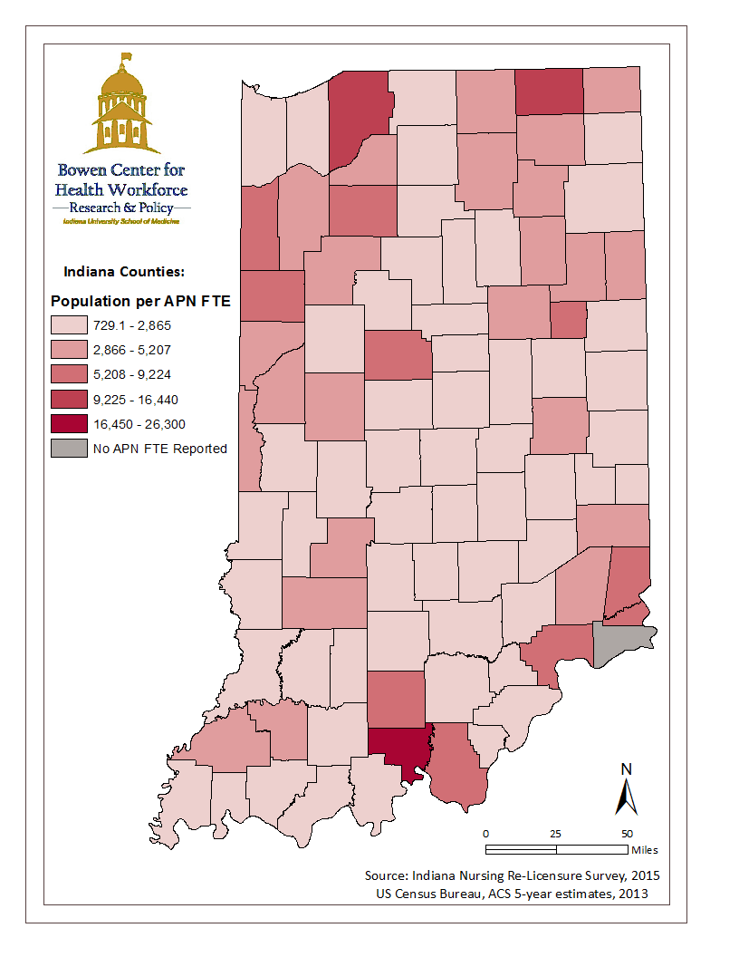
APN
Population per APN Full Time Equivalent (FTE) Ratio
Indiana Counties
This map illustrates the geographic distribution of Indiana’s advanced practice nurse (APN) workforce by mapping the population to APN full time equivalency ratio calculated from data collected during the 2015 Indiana registered nurse renewal process.
Source: Nursing Data Report 2016

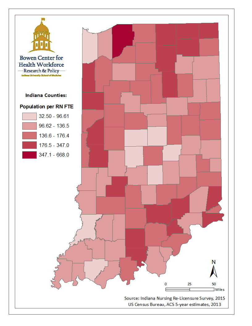
RN
Population per RN Full Time Equivalent (FTE) Ratio
Indiana Counties
This map illustrates the geographic distribution of Indiana’s registered nurse (RN) workforce by mapping the population to RN full time equivalency ratio calculated from data collected during the 2015 Indiana registered nurse renewal process.
Source: Nursing Data Report 2016

Population per RN Full Time Equivalent (FTE) Ratio & Rural Counties
Indiana Counties
This map illustrates the geographic distribution of Indiana’s registered nurse (RN) workforce by mapping the population to RN full time equivalency ratio calculated from data collected during the 2015 Indiana registered nurse renewal process. This map also highlights urban and rural counties in Indiana.
Source: Nursing Policy Report 2017
